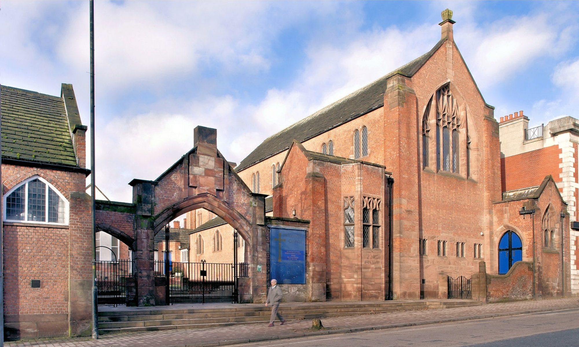

An early Edgar Wood designed commercial building has been restored by the Edgar Wood and Middleton Townscape Heritage Initiative (THI) conservation scheme. The building was in a terribly mutilated state and its appearance is now a hundred times better than it was. The THI, which is superbly managed by Sue Oakley Rochdale MBC conservation officer, is warmly congratulated for its achievement. Bringing historic buildings forward for restoration is a slow and complicated procedure and one that doesn’t always bear fruit.Understanding the Original Design
Guardian Buildings, two bays wide and two storeys high, were commissioned by Fred Bagot, the proprietor of the Middleton Guardian newspaper. He was noted at the time for keeping a very tight rein on finances.
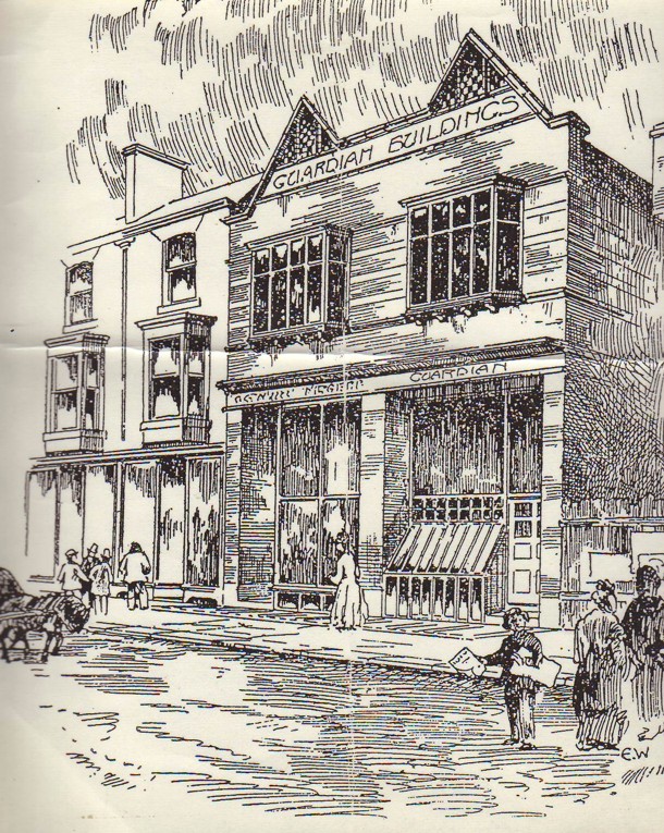
Consequently, Guardian Buildings were one of Edgar Wood’s low cost buildings, of which there are several in and around Middleton. The design houses the operations of the newspaper with the cellar containing the printing machines and the tall ground floor housing a shop, office and more machines. The whole of the first floor, with its pair of oriel windows, was taken up by the composing room. Building plans were submitted on May 31st 1889 and the design sketch (opposite, click to enlarge) was presumably drawn around the same time. The design of Guardian Buildings illustrates just how serious Edgar Wood took the design of modest buildings and how resourceful he could be working with a utilitarian budget.
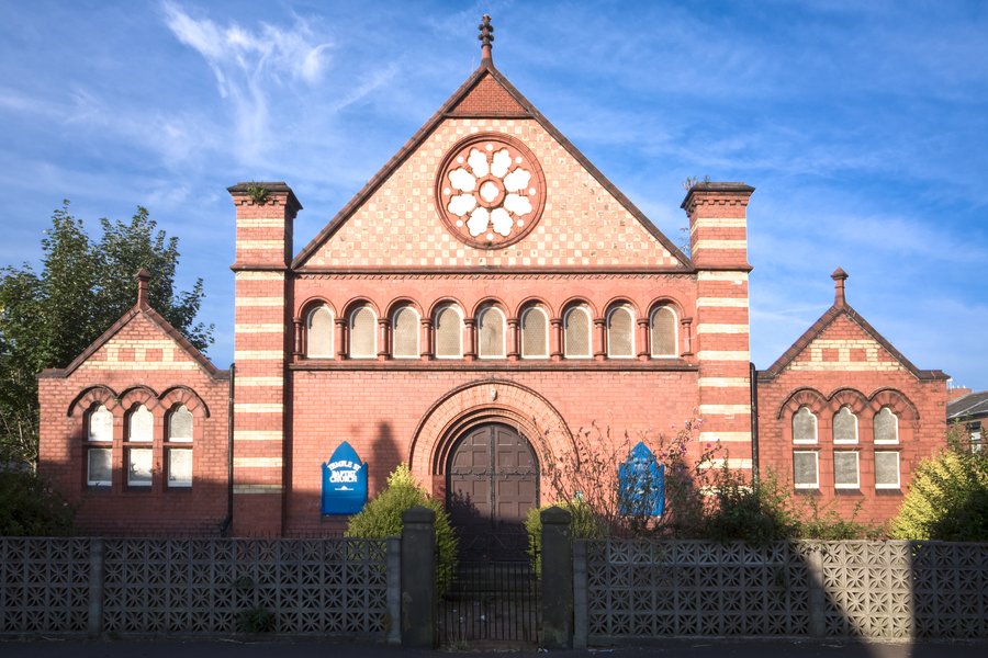
From 1889, Edgar Wood experimented with transferring the then graphic-only art nouveau style with its flowing plant-like forms into architectural design – he was one of the very first in the world to do so. He expressed the vibrant life-form of art nouveau by using vibrant colours, a hint of Japonaiserie and attenuating his buildings by using towers, pillars and the kneeled gable form to act like arrows pointing upwards. Sometimes, as at his house Westdene (also 1889), a tall bay rose like a tower, as if pointing to the sky. Alternatively, as at Temple Street Baptist Church, he used pilasters with little pyramidal roofs on top (since removed) as similar a motif of life and growth.
The sketch for Guardian Buildings shows a striking, even odd looking, façade which has its architectural focus at the top of the building. Three strong pillars of masonry are deliberately emphasised by slightly setting back the shop and office front on the ground floor. The styling of the otherwise functional shop fronts assists the verticality of the masonry pilasters while a Japanese styled canopy juts out above the fascia bringing things to a temporary halt. Nb. Charles Rennie Mackintosh famously used a similar (though much larger) motif to top his Glasgow School of Art of 1896. On the first floor, the two oriel windows are supported by wooden brackets (another Japanese reference). The overall effect is to give the upper floor a sense of forward projection, propelled by the oriel windows and the canopy.
At the top of the composition, there are two triangular gables kneeled gables, ingeniously modified to take the name ‘Guardian Buildings‘ in a long panel which resolves the inherent duality of the design.
The gables contain triangular panels of chequerboard tiling and we know from Temple Street Baptist Church, built the same year, and Rhodes Works Reading Room, built the year after, that the tiles would have been red/orange and creamy yellow in colour (like the bricks used for the stripes on the façade).
Edgar Wood later wrote about the designs of this time saying that he generally wanted the buildings to have an architectural accent set up high, in this case the name panel and chequerboard tiles.
We also know from Edgar Wood’s writings and those of the historian John Archer, that all timber work on Edgar Wood buildings was painted white, the badge of an avant garde designer. However, in such a sooty atmosphere many buildings were repainted either by their owners or by Wood, as explained by Edgar Wood’s Unitarian Minister, “He tried to brighten the darkness… the door was white, but he had to change that because we could not keep it white.”
The Restoration
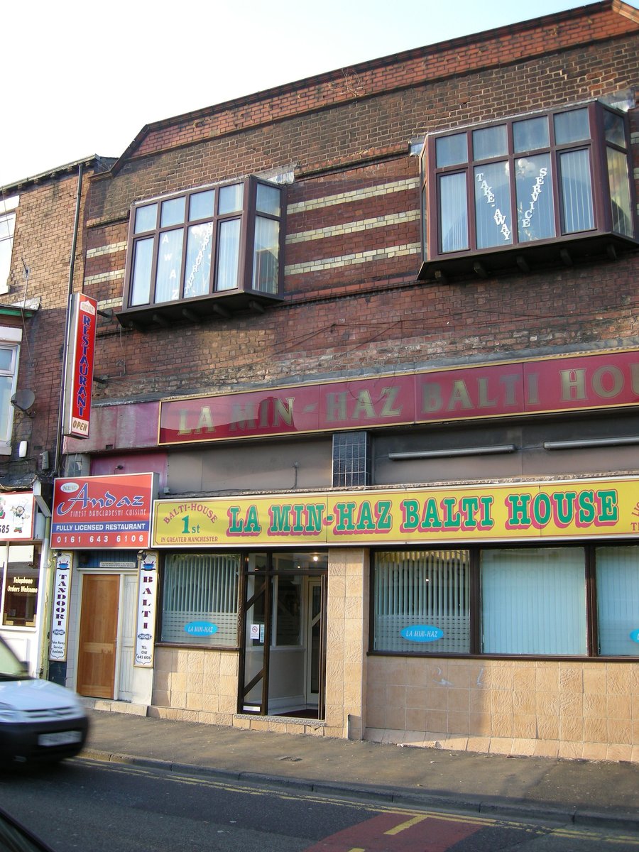
One of the issues the architectural conservator had to contend with in this building was the lack of a ‘magic bullet’ contemporary photograph to literally copy from. There was only a low resolution newspaper image of about two decades later and a partial shot of the 1930s. In this instance, it appears that more weight was given to the later photographs than Edgar Wood’s original sketch and his design philosophy. Nevertheless, it is the sketch which illuminates his design intentions most clearly.
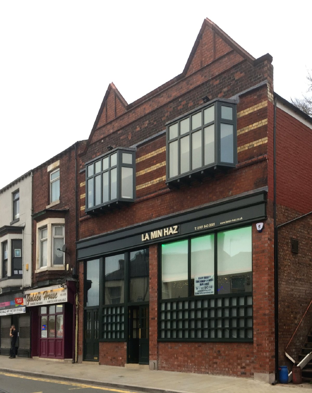
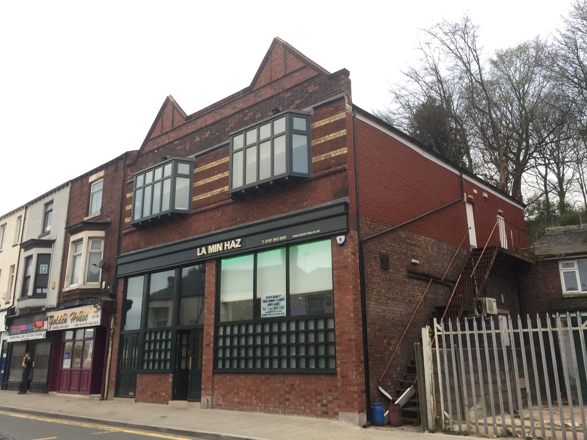
The restoration accurately recreates the original shape and proportions of the Guardian Buildings façade, no mean feat in the circumstances. It also successfully communicates that this was a very different approach to design than the norm, for example with the adjacent buildings.
The restoration has unfortunately been less successful when it comes to detail and it is worth describing this in more detail and the effects this has in not quite recreating Edgar Wood’s intentions.
The ground floor glazing is not set back from the front face of the building, so the pilasters are a less strong feature than intended and there is no sense of a recess beneath the fascia. All is flush on the ground floor at the front of the building and reinstating the various recessed planes would have made for a livelier frontage. This, combined with the lack of the Japanese canopy (a pioneering motif that Wood may have passed to Mackintosh), also means the storey above (with the oriel windows) has distinctly less outward visual projection than intended.
Likewise, the glazing does not extend from ground level, as in the sketch, but sits on brick walls. One suspects this was a client requirement, but one which perhaps could have been handled differently. The glazing bars on the main windows, presumably for the privacy of diners, are a clumsy grid of timber-work. They are too heavy in section to emulate Japanese work and a rather big area compared to Edgar Wood’s subtle suggestion of Japonaiserie. They look like they have been borrowed from a Mackintosh inspired tea shop in Glasgow!
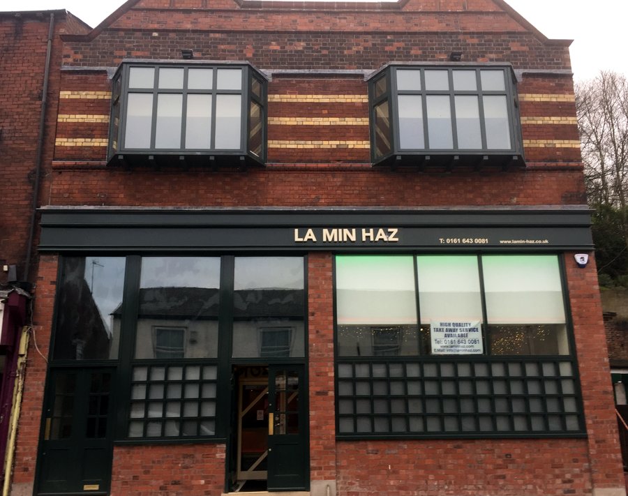
The oriel windows above are well done and are the strongest elements of the façade. Above the oriels, the name panel and the colourful chequerboard tiling are unfortunately missing from the restoration. Consequently, there is no architectural accent above the oriel windows, other than the shape of the ear-like gables. The eye therefore focuses on the duality of the oriel windows and gables.
While the overall effect is massively better than what used to be, it is nevertheless disappointing that the restoration wasn’t quite the success as, for example, the Redcroft scheme on Rochdale Road. An overall dullness pervades the result, caused by the painting of the timber-work dark green, the everyday Victorian colour that Edgar Wood eschewed. Consequently, the architectural vigour that Wood wished to endow this modest building is only partly recreated.
It could be argued that as this was only a modest Wood design, we needn’t get too concerned. Perhaps this is right but it leaves a problem for the architectural guides, spending as much time explaining away the things that aren’t by Edgar Wood as describing those that are. Is it worth taking architectural tourists and students down Market Street to see the restoration? I think so. It shows enough of how Wood tackled low-cost everyday jobs while illustrating the complexities and pitfalls of architectural conservation.
David Morris